
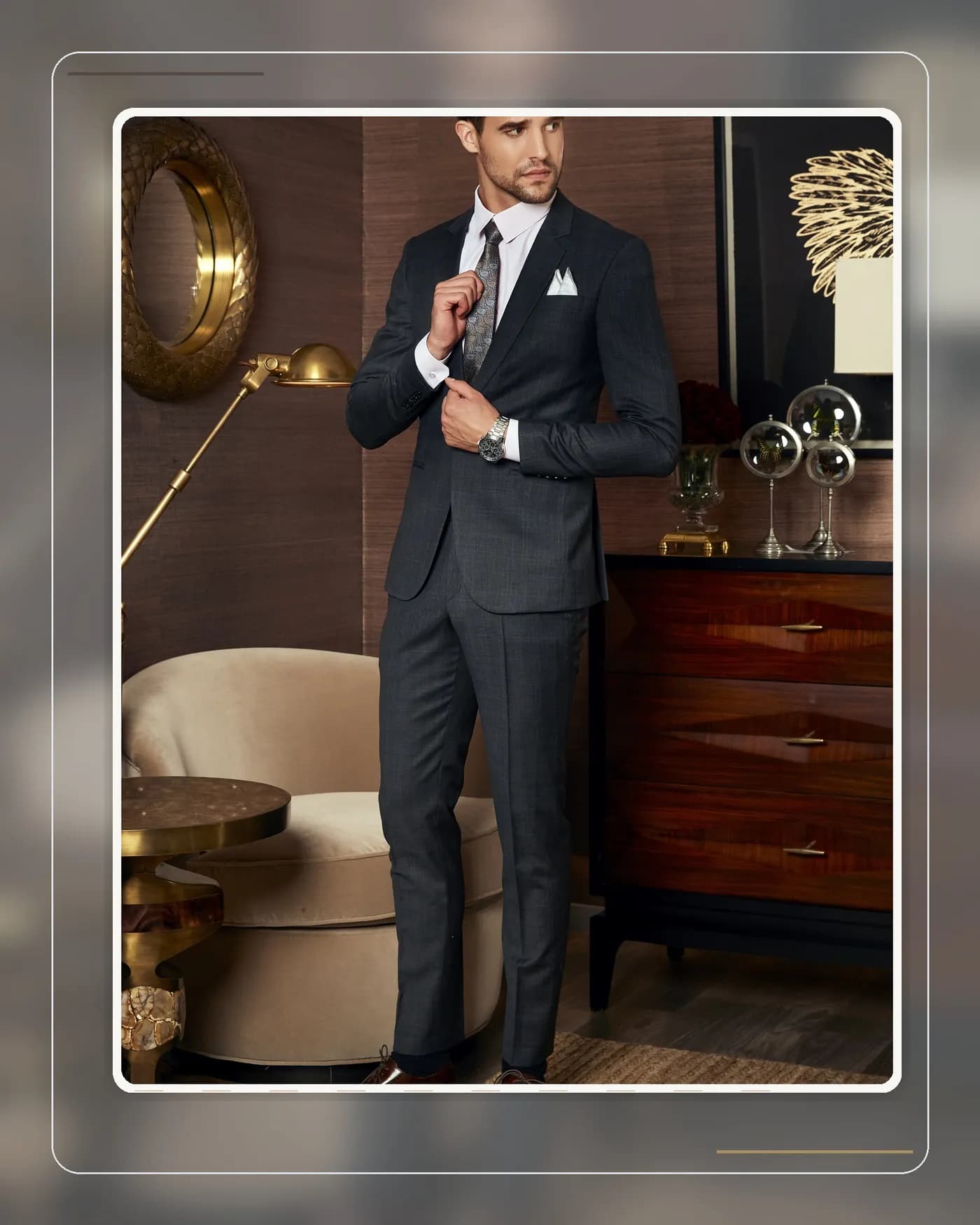
The pocket square is the smallest accessory on a suit, yet the easiest place to overdo it. The line between a refined accent and a garish detail comes down to a single colour decision. This article gives you a simple set of rules so the square always lifts the outfit rather than dragging it down.
The short answer
The golden rule: a pocket square should echo a secondary colour already present in your outfit — the colour in your tie's pattern, your shirt's stripe, or your watch strap — and should never match the tie exactly in colour and fabric. Matching tie-and-square sets sold as a pair are the clearest tell of an untrained eye. When in doubt, choose a white linen or silk square: white works with every suit colour, every occasion, and has never once been considered overdone in the history of menswear.
Three levels of colour choice, from safe to bold
Level 1 — White (cannot fail): a white linen or cotton square in a flat TV fold is the standard from the office to a wedding. If you own only one pocket square, make it this one.
Level 2 — Echo a secondary colour: scan your outfit for the colour that appears least. A navy tie with white dots? A white square, or one with a navy border. A pale blue striped shirt? A patterned square containing pale blue. A colour repeated "by accident" makes the outfit look considered without looking contrived.
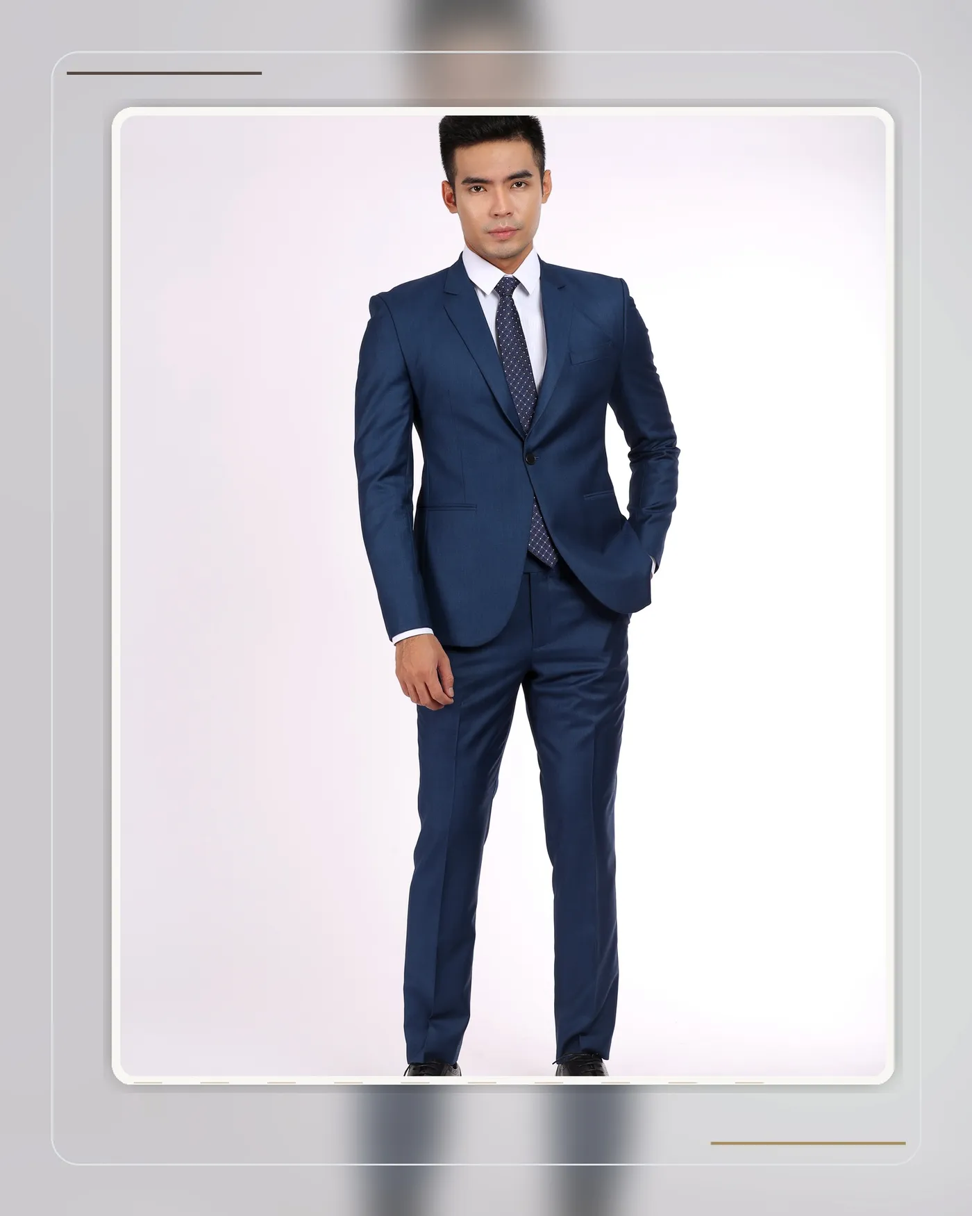
Level 3 — Controlled contrast: a burgundy square on a navy suit, teal on grey — for the confident dresser. The accompanying rule: once the square stands out, every other accessory must retreat to neutral.
Pattern and fabric — the part everyone forgets
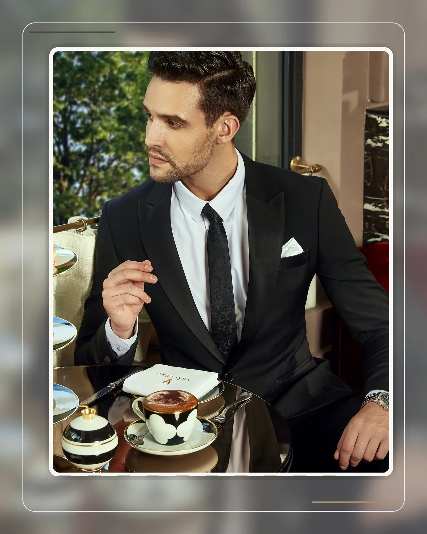
The right colour in the wrong fabric still fails. Lustrous silk suits evening events and formal settings; matte linen and cotton suit daytime and the office. On pattern: paisley prints and large motifs belong only with a plain tie or no tie at all — two large patterns side by side on the chest is the classic recipe for visual noise.
The fold matters too: a crisp TV fold for business, a soft puff fold for celebrations. A square rising more than 3–4 cm above the pocket starts attracting attention in the wrong way.
Common mistakes
- Buying matching tie-and-square sets sold as a pair — the most common and most recognisable error.
- A large-patterned square over a large-patterned tie — the chest becomes a billboard.
- Forgetting context: a brilliant red silk square is superb at an evening party but out of place in a Monday-morning meeting.
A word from Mon Amie's artisans
At Mon Amie, when finishing a suit, our artisans always try a pocket square last — because the chest pocket is where an observer's eye lands right after your face. The advice we repeat most often at the workshop: start with a white linen square, master it, and only then expand into colour. Our regular clients typically need just three — white, one echoing blue tones, one in a warm tone — and that covers a full year of occasions handsomely.
Frequently asked questions
Must a pocket square be worn with a tie? No. A pocket square stands perfectly well on its own — in fact, without a tie it is the detail that keeps a jacket from looking bare.
How many pocket squares does a man need? Three cover everything: white linen, one in cool tones (blue), and one in warm tones (burgundy or earth) with a small pattern.
Isn't a white square boring? No — the white square has been the benchmark of men's style for well over a century. It impresses not through colour, but through polish.
Conclusion
A pocket square is not inherently loud or refined — it all rests on your decisions: echo, don't duplicate; one accent, not two; the right fabric for the right occasion. Master those three rules and this small piece of cloth becomes the best-value style signature on your suit. For advice on the full ensemble, from suiting cloth to accessories, book an appointment with Mon Amie and explore the tailoring process.