
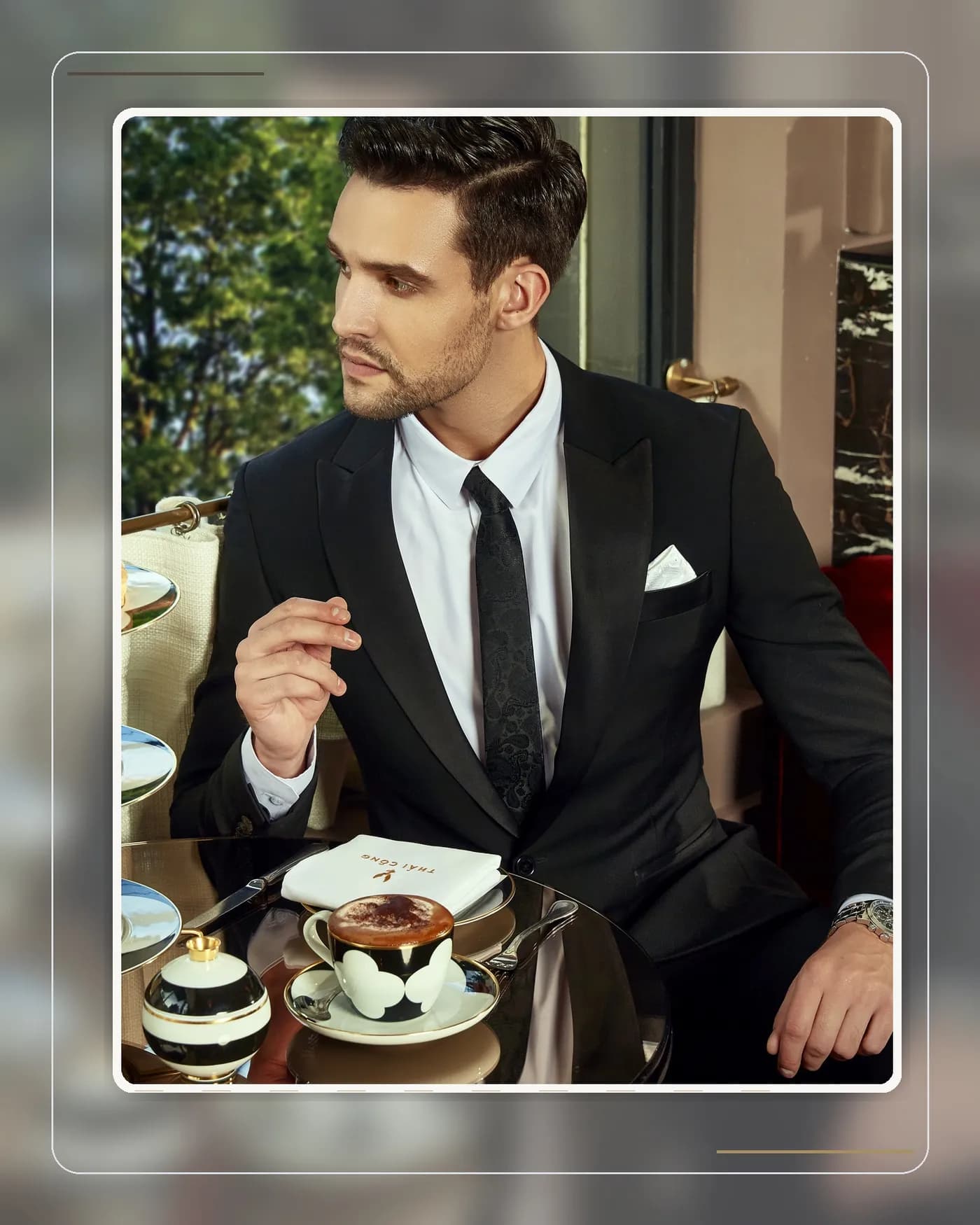
Tone-on-tone — dressing an entire outfit within a single colour family — is one of the techniques the sartorial world admires most, yet it makes many gentlemen hesitate: "won't a head-to-toe single colour look flat and monotonous?" The answer depends entirely on how you handle shade and texture.
The short answer
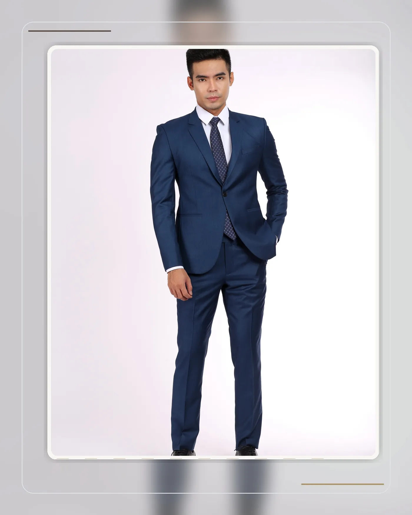
No — tonal dressing is only boring when done wrong. The secret is one word: contrast. Pieces within the same colour family should sit at least two to three shades apart (for example: dark navy suit — pale blue shirt — mid-blue tie), and the outfit should mix at least two fabric surfaces (smooth worsted with knitwear, twill with silk). With enough shade separation and texture variety, a tonal outfit looks richer and deeper than a conventional high-contrast combination.
Why tonal outfits turn into "one block"
The most common mistake is choosing pieces too close in depth: navy suit, navy shirt, navy tie — three items at nearly the same shade, giving the eye nowhere to rest, so the whole look flattens into a single slab. In photographs the effect is even worse, because cameras compress the tonal range.
The fix is simple: stretch the distance. Staying within blue, travel from the near-black navy of the suit, through the pale sky blue of the shirt, to the cobalt of the tie — three clear steps that give the eye a journey.
Three tonal formulas that rarely fail
- The blue column (easiest): dark navy suit + pale blue shirt + mid-blue tie or knit. Blue has the widest shade range of any family, making contrast easiest to build.
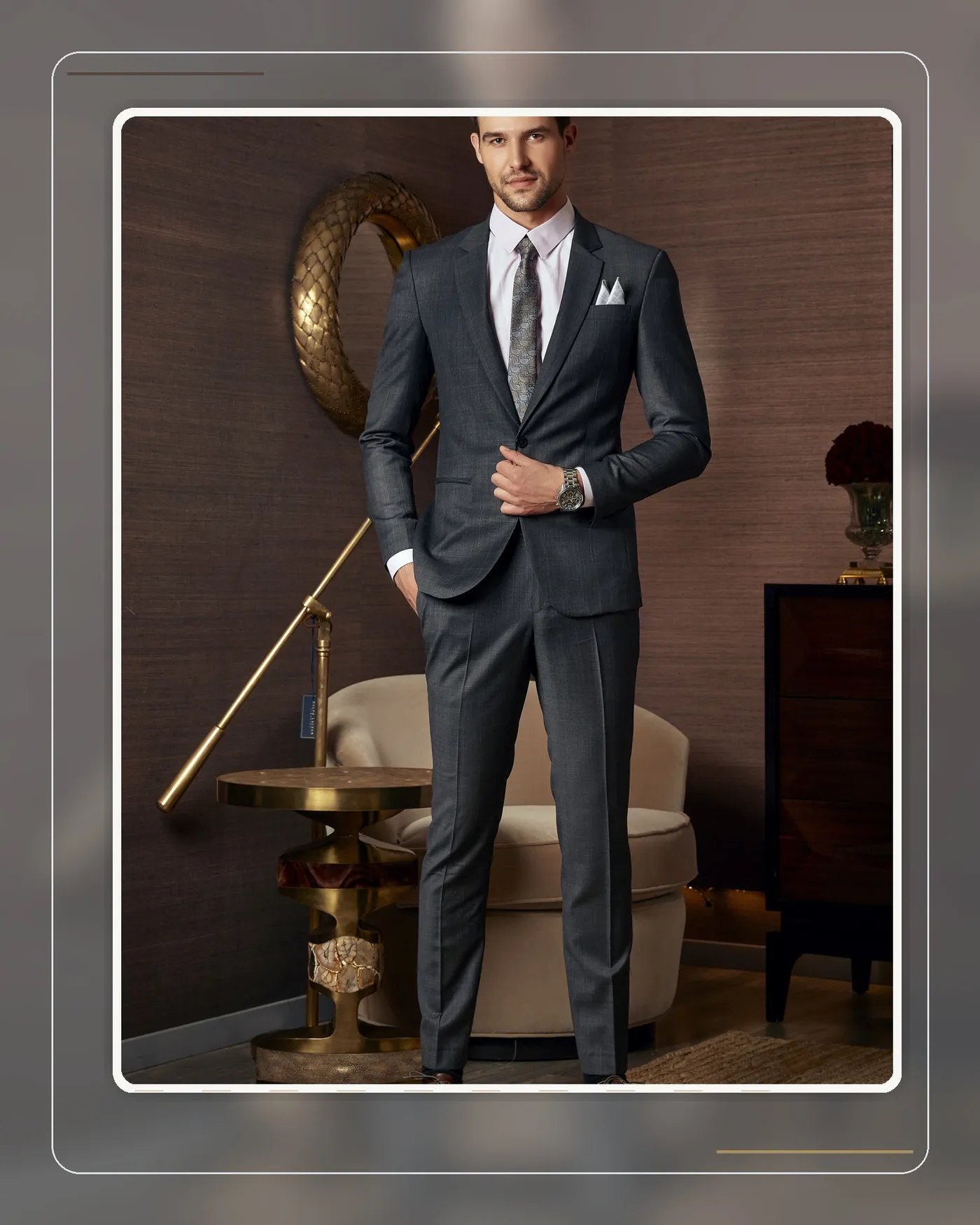
- The grey column: charcoal suit + light grey merino knit + mid-grey trousers or accessories. Add a white shirt as breathing room if it feels heavy.
- The brown-beige column: dark brown jacket + beige trousers + cream knit. A beloved autumn-winter formula — warm, with a distinctly editorial feel.
Texture — the secret weapon of tonal dressing
Once the colours share a family, fabric texture becomes the main storyteller. An all-smooth navy column is monotonous; but the same column with a matte flannel jacket, a crisp poplin shirt, and a grenadine knit tie — light reflecting differently off each surface — creates depth without adding a single colour. This is exactly why Italian sartorial tonal looks read as so expensive: they play with texture, not colour.
Common mistakes
- Pieces at the same shade depth — the outfit flattens into one block.
- Everything in smooth, shiny cloth — no texture, and it reads like a uniform.
- Skipping the photo test: tonal outfits photograph quite differently from real life, so take a test shot before an important occasion.
A word from Mon Amie's artisans
When a client wants to try tonal dressing, Mon Amie's artisans usually start with the navy column — the safest and most shade-rich family. In the fitting room we lay three swatches side by side in natural light so the client can see for himself: when the three shades sit far enough apart, the single-tone outfit gains dimension instead of sinking. For clients who have mastered that, the next step is texture — a knit tie or a matte silk pocket square can sometimes transform the entire feel of the outfit.
Frequently asked questions
Does tonal dressing work for the office? Very well — especially the navy and grey columns, which look polished and tasteful without showiness. Just avoid an entirely dark column in workplaces that call for brightness.
Which colour should a beginner start with? The navy blue family — its shade range is widest, shirts and accessories are easy to find, and it is the hardest family to get wrong.
Does a tonal outfit need an accent in another colour? Not necessarily. If you want one, a single small accent outside the family (a brown-strap watch, a white pocket square) is enough — more would break the tonal effect.
Conclusion
Tonal dressing is not boring — it simply asks you to understand two levers: shade contrast and texture contrast. Master both, and a single-tone outfit becomes one of the most refined, grown-up ways a man can dress. To build a complete tonal look from real cloth, book an appointment with Mon Amie and explore our bespoke service.