
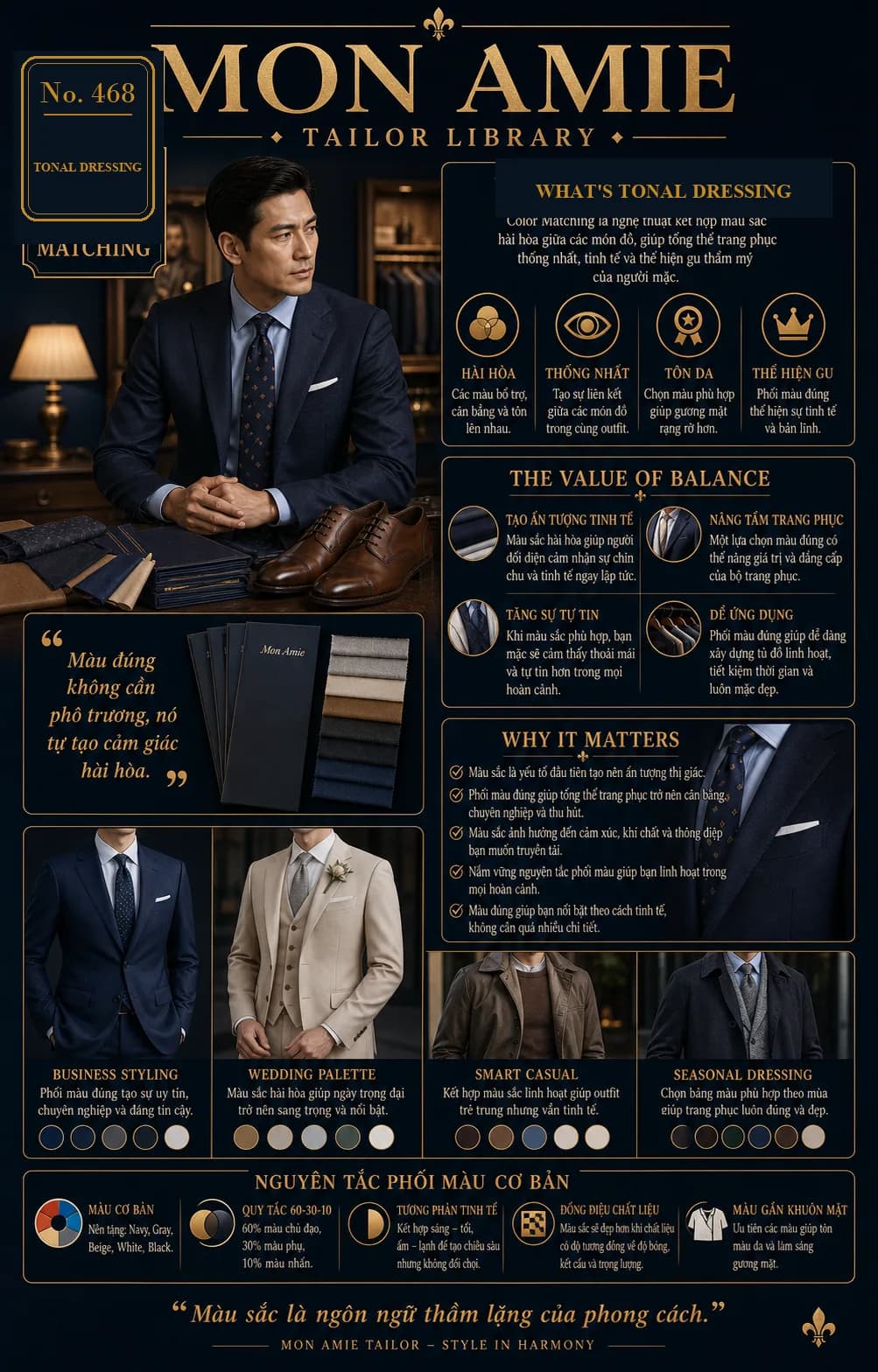
Color matching is the art of combining colors harmoniously across the pieces you wear, so the whole outfit feels unified, refined, and true to your taste. Color is the quiet language of style. The right color never needs to shout — it simply creates a sense of harmony on its own.
The four goals of color coordination
- Harmony: colors support, balance, and elevate one another, with no single shade overpowering the rest.
- Cohesion: the pieces of an outfit connect — jacket, trousers, tie, shoes, and belt all tell the same story.
- Flattering the complexion: well-chosen colors brighten the face, especially in the shirt and tie worn closest to it.
- Expressing taste: getting color right signals refinement and quiet confidence.
Why color matters so much
- Color is the first element of visual impression, before fabric or detail.
- The right combination makes an outfit feel balanced, professional, and appealing.
- Color influences mood, presence, and the message you wish to convey.
- Mastering a few principles gives you flexibility in any situation.
- The right color helps you stand out in a subtle way, without needing extra detail.
Five fundamental principles of color matching
- Foundation colors: navy, gray, beige, white, and black. Build your wardrobe around these five and almost everything will pair with everything else.
- The 60-30-10 rule: 60% dominant color (usually the suit), 30% secondary color (the shirt), 10% accent color (tie, pocket square).
- Subtle contrast: pair light with dark, warm with cool, to create depth without conflict. Navy with a pale blue shirt is the classic example.
- Matching textures: colors look best when fabrics share a similar sheen, texture, and weight. Gray flannel sits better with a wool tie than with glossy silk.
- Colors near the face: prioritize shades that flatter your skin tone and brighten the face around the collar.
Palettes for every occasion
- Business styling: navy, deep blue, charcoal, gray, and white. The right combination conveys authority, professionalism, and trust.
- Wedding palette: beige, cream, sand, light gray, and white. Harmonious colors make the big day feel elegant and distinctive.
- Smart casual: brown, camel, denim blue, gray, and cream. Flexible combinations keep the outfit youthful yet refined.
- Seasonal dressing: choose your palette by season — warm tones, browns, and moss greens for cooler months; pale, bright, cool shades for the heat.
The value of balance
- A refined impression: harmonious color reads as polish the moment someone sees you.
- Elevating the outfit: one well-judged color choice can lift the value and standing of the entire ensemble.
- Greater confidence: when the colors are right, you feel at ease and assured in any setting.
- Easy to apply: sound color matching builds a versatile wardrobe, saves time, and keeps you well dressed every day.
A word from Mon Amie's artisans
During a consultation, a Mon Amie tailor will often hold the fabric up near your face in natural light before discussing anything else — because the very same navy can flatter one man and dull another's complexion. We also consider your shoes, belt, and the suits you already own, so the new one blends into your existing wardrobe rather than standing apart.
If you would like to see the fabric books in person and try colors against your own skin, we invite you to book an appointment at any of Mon Amie's five showrooms in Ho Chi Minh City — Nguyen Trai, Ho Van Hue, 3/2 Street, Caravelle Hotel District 1, and Nguyen Thi Thap — or call our hotline at 0888.111.118. You may also browse our pricing beforehand, from a complete suit at VND 4.8 million in Kevinlli cloth up to the great mills: Canonico, Holland & Sherry, Dormeuil, and Scabal.